CHICAGO COFFEEHOUSE
DESCRIPTION
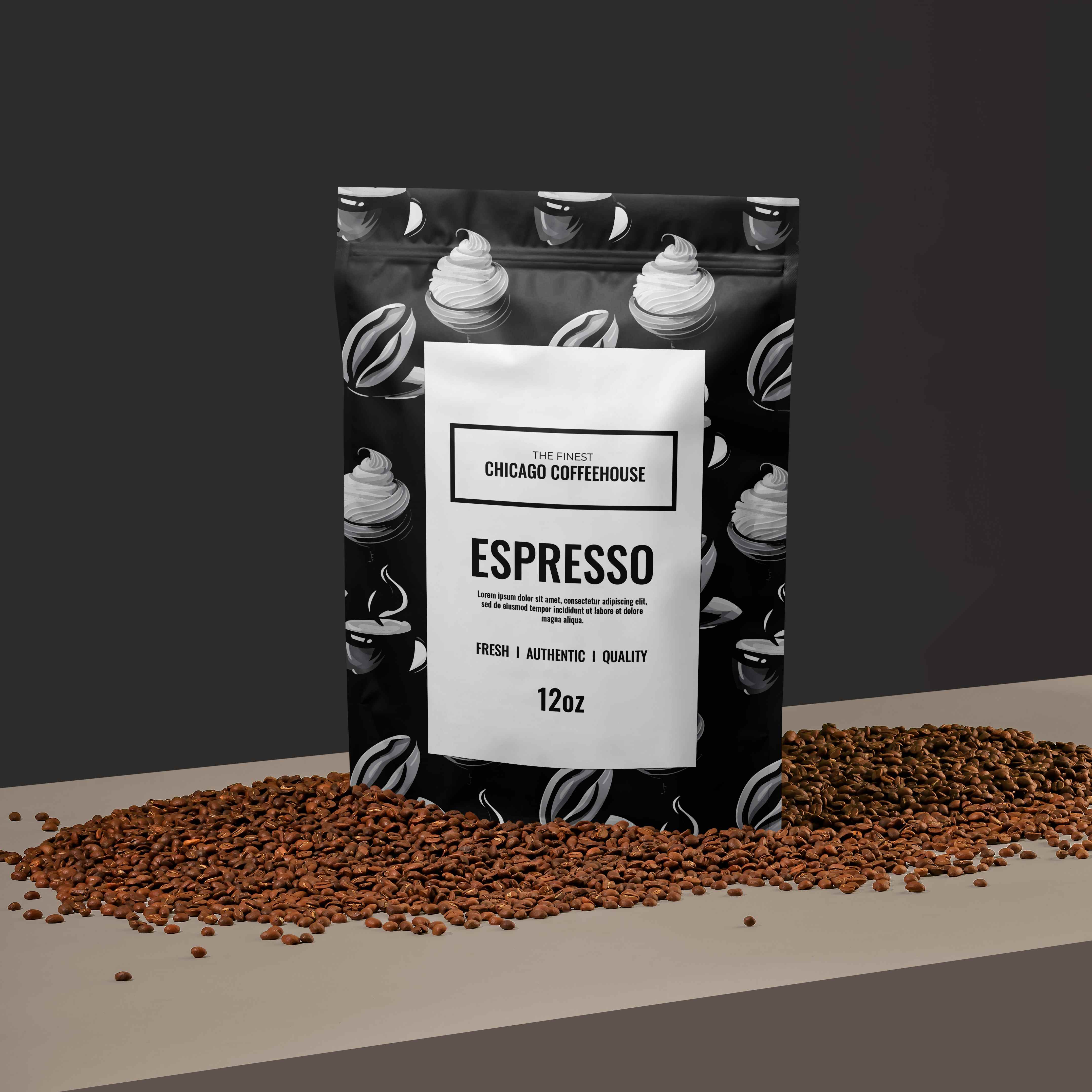
Embark on an exciting packaging design project for a dynamic coffee brand, infusing creativity and elegance into every detail to captivate consumers' attention on the shelves. With a focus on pattern design, the goal is to create packaging that not only preserves the freshness of the coffee but also reflects the brand's identity and engages customers visually.
PROJECT GOALS
By aligning the new brand identity with these three main goals, we can create a compelling and impactful visual representation that not only pays homage to its roots but also propels the brand forward with a fresh and distinctive look that resonates with customers and stands out in the market.
KEEP BRANDING CONSISTENT
While evolving the brand identity, it is essential to retain certain familiar elements from the old logo to ensure a seamless transition and maintain brand
recognition among existing customers.
PATTERN DESIGN
Conceptualize and develop captivating patterns that convey the brand's story, evoke emotions, and differentiate the product on the crowded shelves of coffee aisles.
COLOUR PALETTE
The thoughtfully curated selection of colors embodies the essence of the brand's identity. From vibrant hues to subdued tones, each shade tells a unique story. These colors transcend mere pigments, reflecting the brand's versatility and depth.

PURITY
White exudes elegance through its timeless simplicity and purity, evoking a sense of sophistication and refinement in any design. Its clean and minimalist aesthetic serves as a blank canvas, allowing other elements to shine while imparting a sense of luxury and understated elegance.

ELEGANCE
Black exudes elegance due to its timeless simplicity and its ability to convey sophistication and refinement effortlessly, making it a versatile choice for fashion, design, and luxury branding.
TYPOGRAPHY
The selected typeface showcases a dedication to transparent communication and inclusivity. Carefully chosen for it's legibility and enduring aesthetic, it effortlessly conveys the message, allowing all individuals to interact with the brand seamlessly. The typography embodies the belief that elegance thrives in simplicity, inviting a universal connection to the narrative.

OSWALD
FINAL DESIGN
The coffee packaging design project culminates in a visually stunning and functional outcome that embodies the essence of the brand. With captivating patterns inspired by the world of coffee, sustainable packaging materials, and meticulous attention to detail, the final designs not only preserve the freshness of the coffee but also elevate the brand's identity, captivating consumers' attention and enhancing their overall coffee experience.


