WHISKER'S RETREAT
DESCRIPTION
Looking into the target audience, I delved into understanding their core values and goals, ensuring that every design element reflected their passion for feline companionship and the cozy ambiance they aimed to cultivate. The result was more than a mere visual overhaul—it was the birth of a refreshed and sophisticated brand image. This transformative process not only elevated the cafe's professional standing within the competitive market but also struck a resonant chord with their target audience.
STARTING POINT
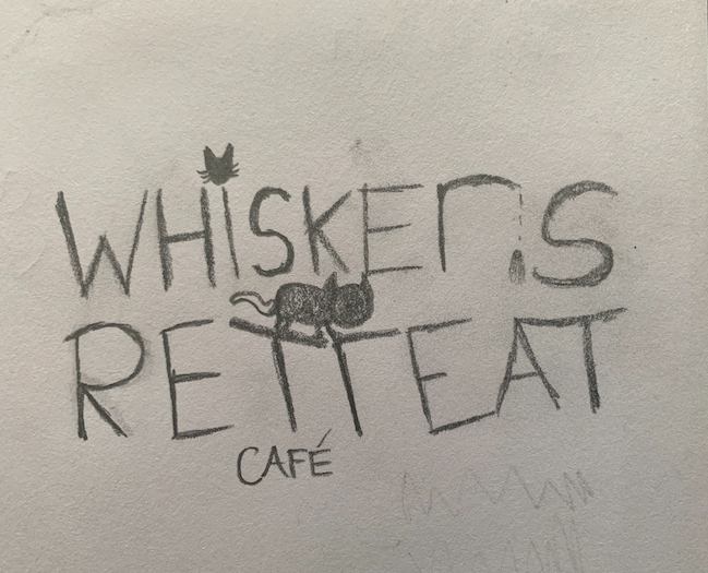
Embarking on the creative journey, the inception of the logo began with an extensive sketching phase, where I devoted time to explore various concepts and structures. This iterative process allowed me to hone in on the perfect balance that captured the essence of the cat cafe. Experimenting with fonts and hand-drawn graphics became an integral part of shaping the logo's personality, each stroke and curve contributing to the narrative.
PROJECT GOALS
Aligning the fresh brand identity with two primary objectives, we aim to craft a compelling visual representation that pays homage to its roots while propelling the brand forward. This distinctive look resonates with customers and ensures a standout presence in the market.
GETTING OUT OF MY COMFORT ZONE
Stepping out of your comfort zone is crucial for personal growth, fostering resilience, and unlocking new opportunities that expand your skills and perspectives.
SIMPLISTIC
Simplicity is a powerful tool in logo design. The goal is to craft a logo that is visually straightforward and instantly recognizable,
even at a glance.
COLOUR PALETTE
The thoughtfully curated selection of colors embodies the essence of the brand's identity. From vibrant hues to subdued tones, each shade tells a unique story. These colors transcend mere pigments, reflecting the brand's versatility and depth.

CONFIDENCE
Reflecting the confidence and dominance of the feline persona.

CALM
The color cream is calming as its soft, neutral tones evoke a sense of tranquility and warmth, providing a soothing visual experience

SOPHISTICATION
Black is considered sophisticated due to its timeless elegance, depth, and ability to convey a sense of refinement, making it a symbol of understated luxury and style.
TYPOGRAPHY
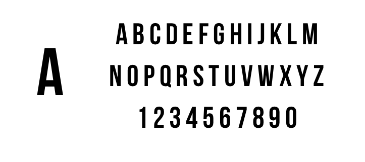
I opted for Bebas Neue as the font choice for its bold and robust characteristics, reminiscent of the innate strength and confidence of a cat. This selection aims to provide the project with a sophisticated and compelling visual identity, aligning seamlessly with the professional standards sought for the overall brand representation."
BEBAS NEUE
FINAL LOGO
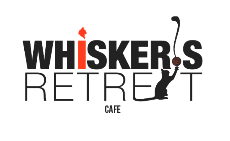
The final logo is a culmination of meticulous design, where I leveraged Adobe Illustrator to experiment with fonts and graphic elements extensively. The refined outcome reflects a harmonious blend of creative exploration and technical precision, encapsulating the essence of the brand with sophistication and visual impact.
MOCKUPS
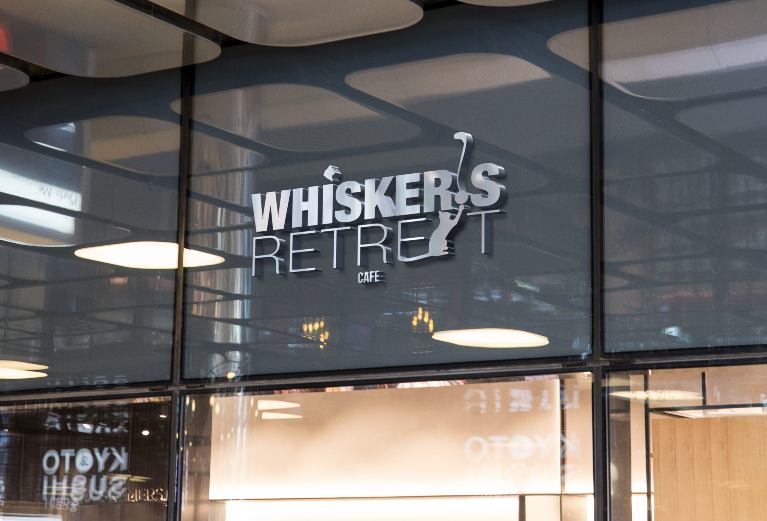
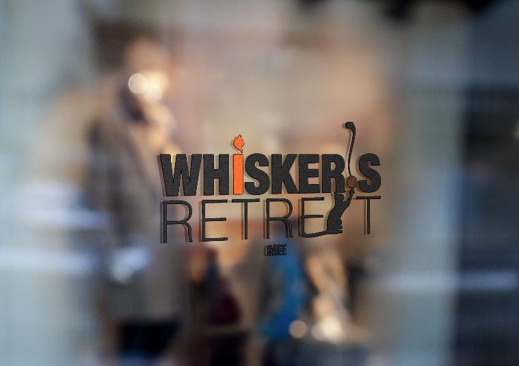
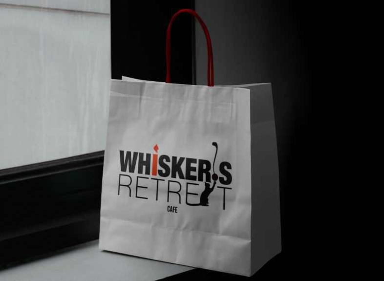
I employed Adobe Photoshop to skillfully present the logo in various contexts. Using mockups is pivotal, allowing a dynamic visualization of the logo in real-world scenarios, ensuring its adaptability and impact across diverse applications and reinforcing its practical effectiveness in different contexts.
