snooze bedding
DESCRIPTION
This project is a vibrant exploration into the world of playfulness. From lively colour palettes to whimsical design elements, the aim is to craft an experience that radiates joy.
STARTING POINT
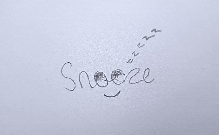
After curating inspiration from a detailed mood board, the inception of most of my logos involves translating concepts into a basic sketch. This foundational step serves as a creative springboard, allowing me to explore various design directions and refine the initial vision. As I build upon this sketch, each stroke and element is carefully considered, ensuring the logo evolves organically while staying true to the essence captured in the mood board. This iterative process not only fosters creativity but also lays the groundwork for a final design that resonates with the intended aesthetic and messaging.
PROJECT GOALS
Setting goals is my personal compass, guiding my journey with clarity and purpose. Establishing them early on fuels my motivation and provides a roadmap to success. Defining clear objectives allows me to make informed decisions, stay resilient in the face of challenges, and ultimately, achieve a sense of fulfilment in my endeavours.
QUALITY
With an unwavering dedication to quality, the brand aims to establish itself as a trusted symbol of durability, craftsmanship, and overall excellence, ensuring that every product reflects the utmost in quality and authenticity.
PLAYFUL
As a creative visionary, my aspiration is to cultivate a brand that radiates playfulness and embraces experimentation with a fresh, innovative perspective.
COLOUR PALETTE
As I curate the colour palette, my vision is to weave a tapestry that embodies both playfulness and trustworthiness. Vibrant hues bring a sense of joy and creativity, while grounded tones instill a feeling of reliability. This intentional blend creates a dynamic and inviting colour scheme, reflecting my brand's character—playful yet steadfast in authenticity and trustworthiness.

TRUST
This versatile hue can evoke a feeling of security and confidence, creating a sense of tranquility and dependability in various contexts.

PLAYFULNESS
This refreshing and airy hue often evokes a sense of calmness and tranquility, creating a playful and welcoming atmosphere.
TYPOGRAPHY
In choosing the typography for my brand, I'm drawn to a playful font that mirrors the brand's vibrant and creative spirit. The goal is to convey a sense of joy and approachability, ensuring that every written element resonates with the brand's lively personality.
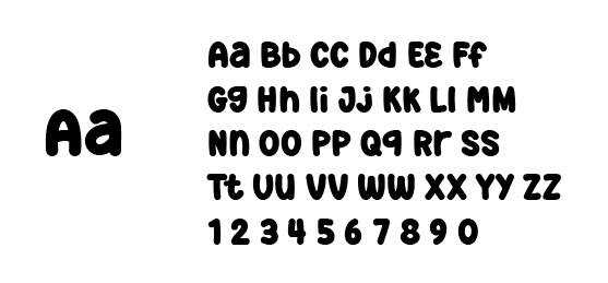
SUPER FRESH
FINAL LOGO
My primary intention is to craft a visual symbol that seamlessly blends playfulness with trustworthiness. The logo is a vibrant reflection of the brand's character, exuding joy and creativity while instilling a sense of reliability. Through playful design elements and thoughtful composition, the logo becomes a trustworthy emblem that not only captures attention but also fosters a positive and lasting connection with the audience.

MOCKUPS
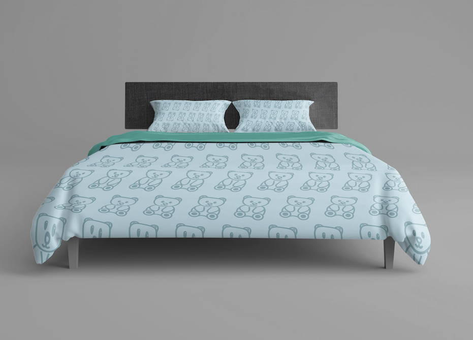
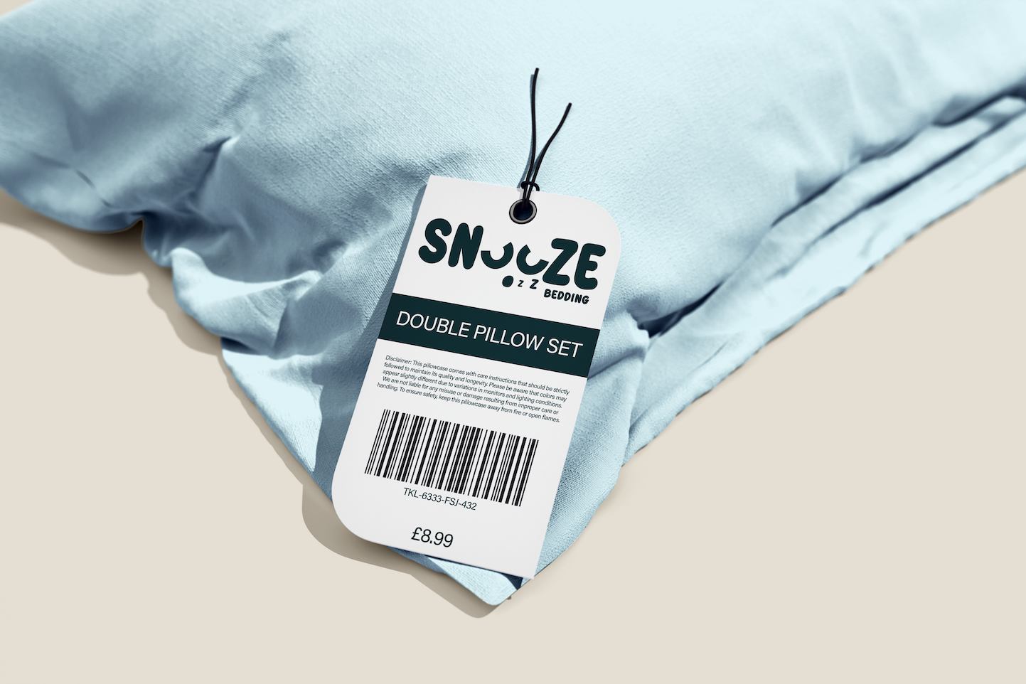
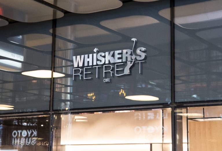
I utilised Adobe Photoshop to adeptly showcase the logo in diverse contexts. Employing mockups is crucial, providing a dynamic portrayal of the logo in real-world scenarios. This ensures its versatility and impact across various applications, reinforcing its practical efficacy in different settings.
