SHADES SPRAYING SOLUTIONS
DESCRIPTION
The project involved meticulous attention to detail, strategic design choices, and collaboration with the client to align the brand with their values and goals. The result: a refreshed and sophisticated brand image that not only elevated the company's professional standing but also resonated with their target audience
STARTING POINT
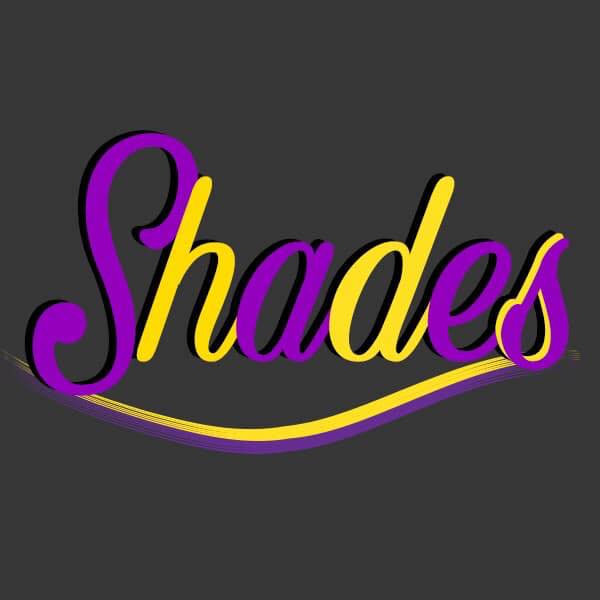
Delve into the rebranding journey, starting with the original logo—a pivotal moment that set the course for the transformation towards our refined and impactful brand identity.
PROJECT GOALS
By aligning the new brand identity with these three main goals, we can create a compelling and impactful visual representation that not only pays homage to its roots but also propels the brand forward with a fresh and distinctive look that resonates with customers and stands out in the market.
KEEP BRANDING CONSISTENT
While evolving the brand identity, it is essential to retain certain familiar elements from the old logo to ensure a seamless transition and maintain brand
recognition among existing customers.
SIMPLISTIC
Simplicity is a powerful tool in logo design.
The goal is to craft a logo that is visually
straightforward and instantly recognizable,
even at a glance.
MEMORABLE VISUAL IDENTITY
The new brand identity should be
distinctive, leaving a lasting impression on
potential customers.
COLOUR PALETTE
The thoughtfully curated selection of colors embodies the essence of the brand's identity. From vibrant hues to subdued tones, each shade tells a unique story. These colors transcend mere pigments, reflecting the brand's versatility and depth.

CREATIVITY
Yellow can stimulate the mind and foster creative thinking and innovation

BALANCE
Purple is a blend of the stability of blue and the energy of red, suggesting a harmonious equilibrium.

WISDOM
It can represent wisdom, introspection, and depth of thought.
DESIGN CONCEPTS
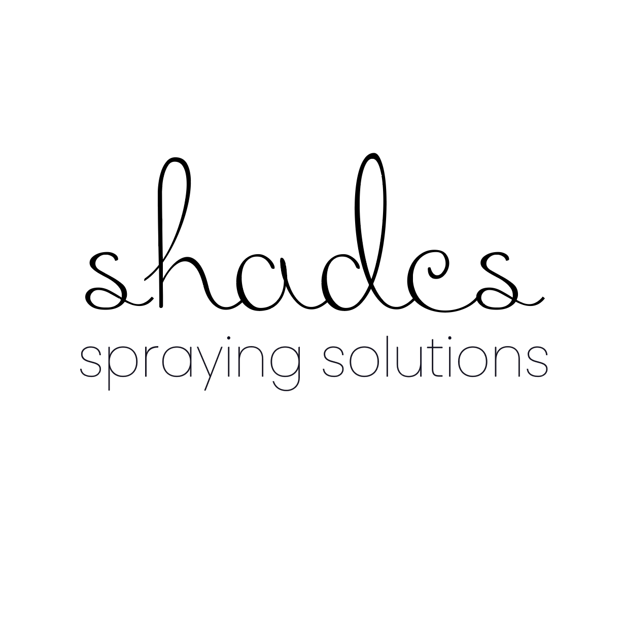
In the design concept phase, we presented the client with three distinct creative directions, each a thoughtful exploration of the brand's evolution. The first option focused on a timeless and classic approach, emphasizing the brand's reliability and longevity. Option two embraced a modern and minimalist aesthetic, conveying a sense of sleek professionalism. The final option played with dynamic shapes, injecting energy and versatility into the brand. Each concept aimed to evoke a unique emotion while staying true to the core values of the company.
SIMPLE

MODERN
PLAYFUL
TYPOGRAPHY
The selected typeface showcases a dedication to transparent communication and inclusivity. Carefully chosen for it's legibility and enduring aesthetic, it effortlessly conveys the message, allowing all individuals to interact with the brand seamlessly. The typography embodies the belief that elegance thrives in simplicity, inviting a universal connection to the narrative.
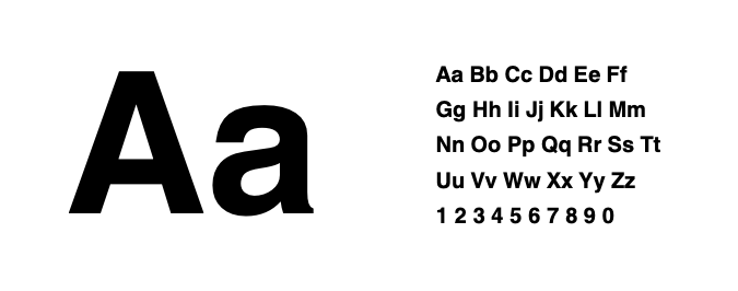
HELVETICA
FINAL LOGO VARIATIONS
The brand logo elegantly captures the essence of 'Shades.' Designed with a focus on simplicity, it artfully plays on the company's name, integrating color palettes that resonate with the core theme. This sophisticated icon embodies both our commitment to simplicity and the diverse spectrum of colors that inspire the services.
PRIMARY LOGO
This is the main logo for the brand, it contains all the elements of the branding. This can be used on a
multitude of ways, for example, it can work great as a social media icon.
SECONDARY LOGO
This logo can be used interchangeably with the primary logo. It is constructed to be applied in instances where a horizontal layout is better suited. It ensures the crucial elements can be included still. This is suited for instances like banners.
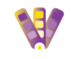
ICON
The Icon Mark is to be used in situations where you're limited on space and still need brand
recognition. It can be used at scale
and in limited spaces.
