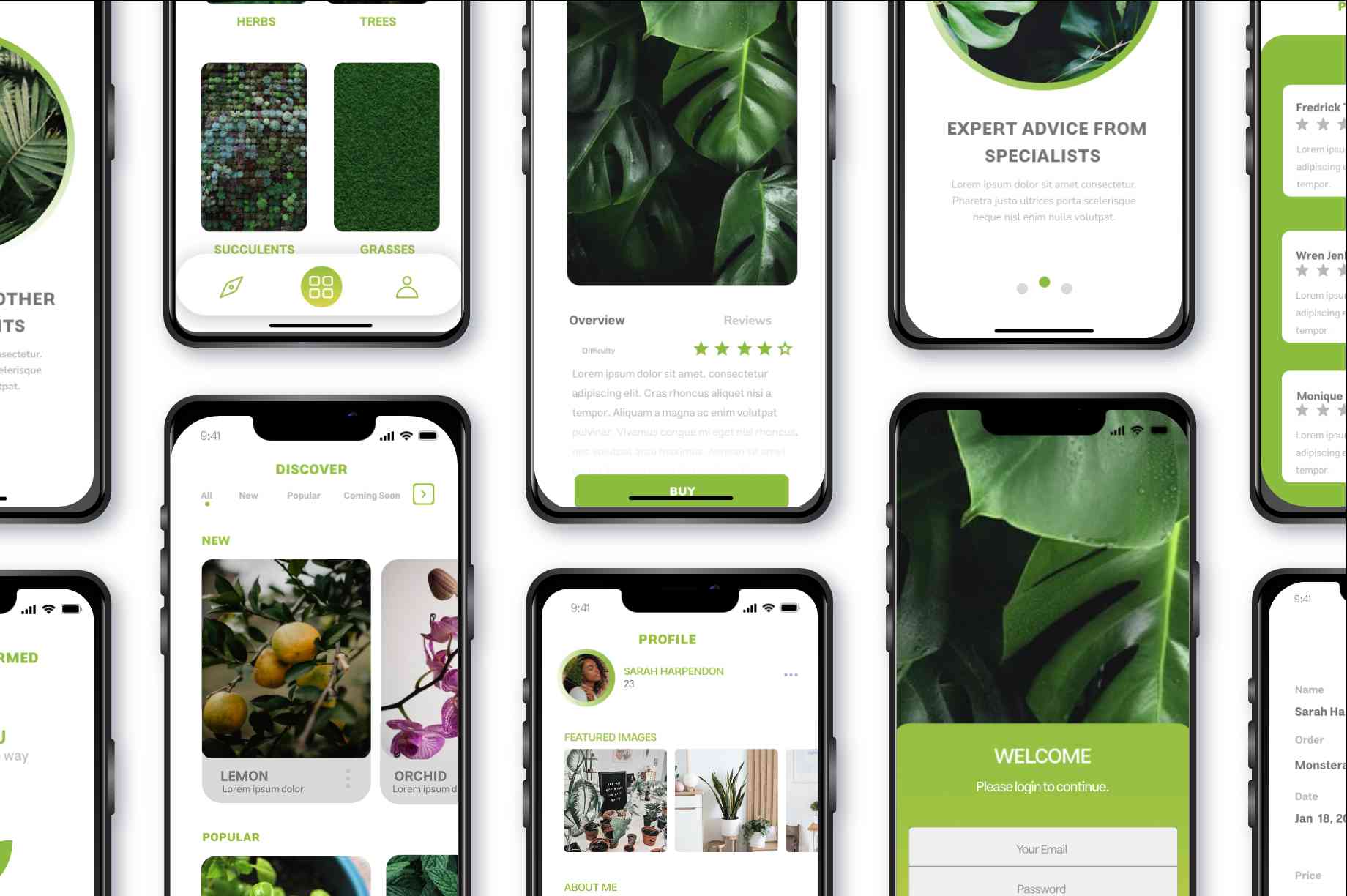
THE HIVE PLANT
DESCRIPTION
Embark on an engaging app design project for "The Hive Plant," a dynamic mobile application aimed at plant enthusiasts and hobbyists. With a focus on user-friendly interface design and innovative features, the goal is to create an intuitive platform that educates, inspires, and connects users with their passion for plants.
PROJECT GOALS
By aligning the new brand identity with these two main goals, we can create a compelling and impactful visual representation that not only pays homage to its roots but also propels the brand forward with a fresh and distinctive look that resonates with customers and stands out in the market.
USER EXPERIENCE
Prioritise user experience (UX) design to ensure seamless navigation and intuitive interactions throughout the app.
SIMPLISTIC
Simplicity is a powerful tool in logo design.
The goal is to craft a logo that is visually
straightforward and instantly recognizable,
even at a glance.
COLOUR PALETTE
The thoughtfully curated selection of colors embodies the essence of the brand's identity. From vibrant hues to subdued tones, each shade tells a unique story. These colors transcend mere pigments, reflecting the brand's versatility and depth.

BALANCE
White represents purity, simplicity, and cleanliness, serving as a perfect complement to green in the project. It was used alongside green to create a harmonious and balanced visual aesthetic. White provides a clean backdrop that allows the vibrant green elements to stand out, enhancing the overall freshness and vitality conveyed by the app's theme of nature and plants

NATURE
Green represents growth, harmony, and balance, making it an ideal choice for the project because it aligns perfectly with the theme of nature and plants. It's associated with freshness, vitality, and renewal, evoking feelings of tranquility and connection to the natural world. By using green prominently in the project, it not only communicates the app's focus on plants and gardening but also creates a calming and welcoming atmosphere for users, reinforcing the app's mission to inspire and empower individuals to cultivate their green spaces.
TYPOGRAPHY
The selected typeface showcases a dedication to transparent communication and inclusivity. Carefully chosen for it's legibility and enduring aesthetic, it effortlessly conveys the message, allowing all individuals to interact with the brand seamlessly. The typography embodies the belief that elegance thrives in simplicity, inviting a universal connection to the narrative.

NUNITO
FINAL LOGO VARIATIONS
Through intuitive navigation, educational content, and interactive features like plant identification and community engagement, the app becomes an indispensable tool for users to cultivate their passion for plants, fostering learning, inspiration, and connection within the gardening community.


