HOT TENT
DESCRIPTION
"Hot Tent," a leading business card company specialising in innovative and high-quality print products. The goal is to create visually striking and memorable business card designs that reflect Hot Tent's commitment to excellence, creativity, and professionalism, while also showcasing the range of printing capabilities and options available to clients.
STARTING POINT
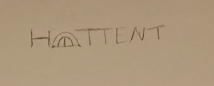
Before finalising the design, I sketched several iterations of the logo to explore different concepts and ensure the best representation of the brand's identity.

PROJECT GOALS
By aligning the new brand identity with these three main goals, we can create a compelling and impactful visual representation that not only pays homage to its roots but also propels the brand forward with a fresh and distinctive look that resonates with customers and stands out in the market.
SIMPLISTIC
Simplicity is a powerful tool in logo design.
The goal is to craft a logo that is visually
straightforward and instantly recognizable,
even at a glance.
MEMORABLE VISUAL IDENTITY
The new brand identity should be
distinctive, leaving a lasting impression on
potential customers.
COLOUR PALETTE
The thoughtfully curated selection of colors embodies the essence of the brand's identity. From vibrant hues to subdued tones, each shade tells a unique story. These colors transcend mere pigments, reflecting the brand's versatility and depth.

WARMTH
A touch of earthiness and authenticity to the brand identity, reflecting the rugged beauty of nature and the spirit of exploration associated with camping.

BALANCE
Represents the natural elements of outdoor camping and adventure. It conveys a sense of warmth and coziness, reminiscent of sunlight streaming through a tent, and creates a welcoming and inviting atmosphere for outdoor enthusiasts.

WISDOM
Black adds depth and sophistication to the brand identity, grounding the vibrant yellows and adding a sense of stability and professionalism.
TYPOGRAPHY
The selected typeface showcases a dedication to transparent communication and inclusivity. Carefully chosen for it's legibility and enduring aesthetic, it effortlessly conveys the message, allowing all individuals to interact with the brand seamlessly. The typography embodies the belief that elegance thrives in simplicity, inviting a universal connection to the narrative.

NUNITO
FINAL DESIGN
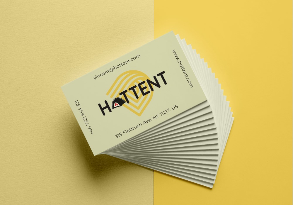
The outcome of the business card design project for Hot Tent is a visually striking and memorable business card designs that embody the company's commitment to excellence and creativity.


