TINY TOPPINGS
DESCRIPTION
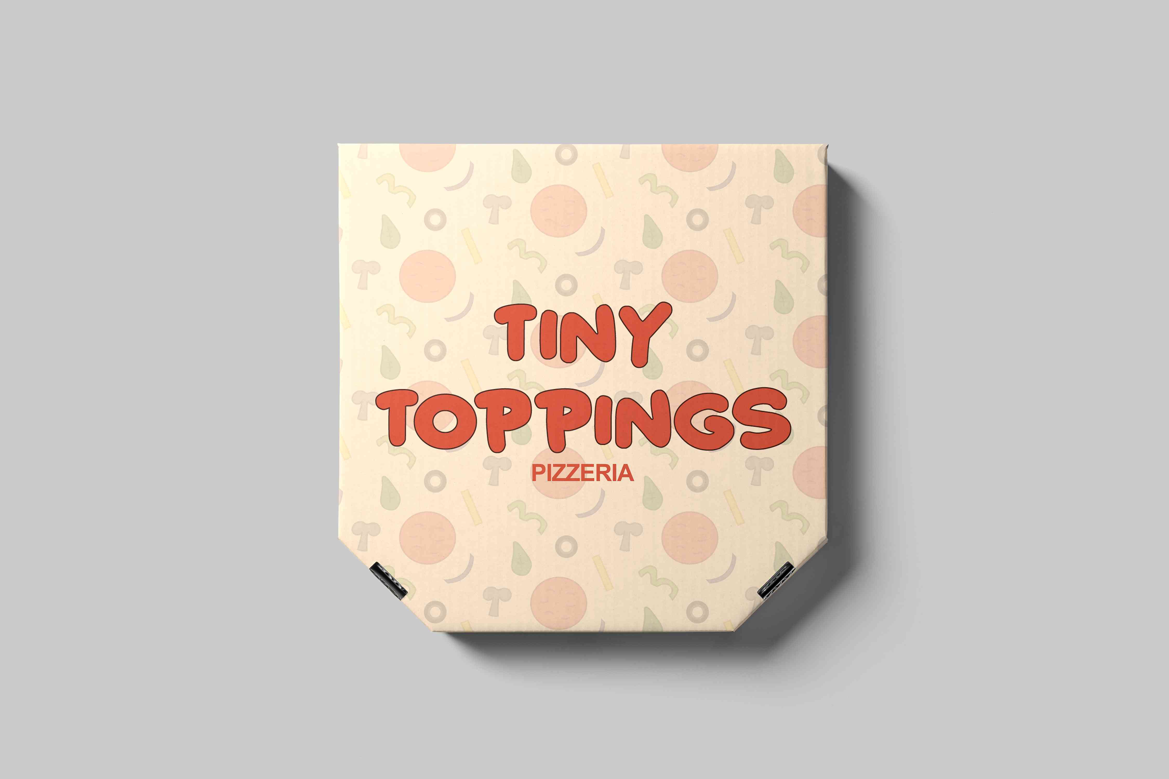
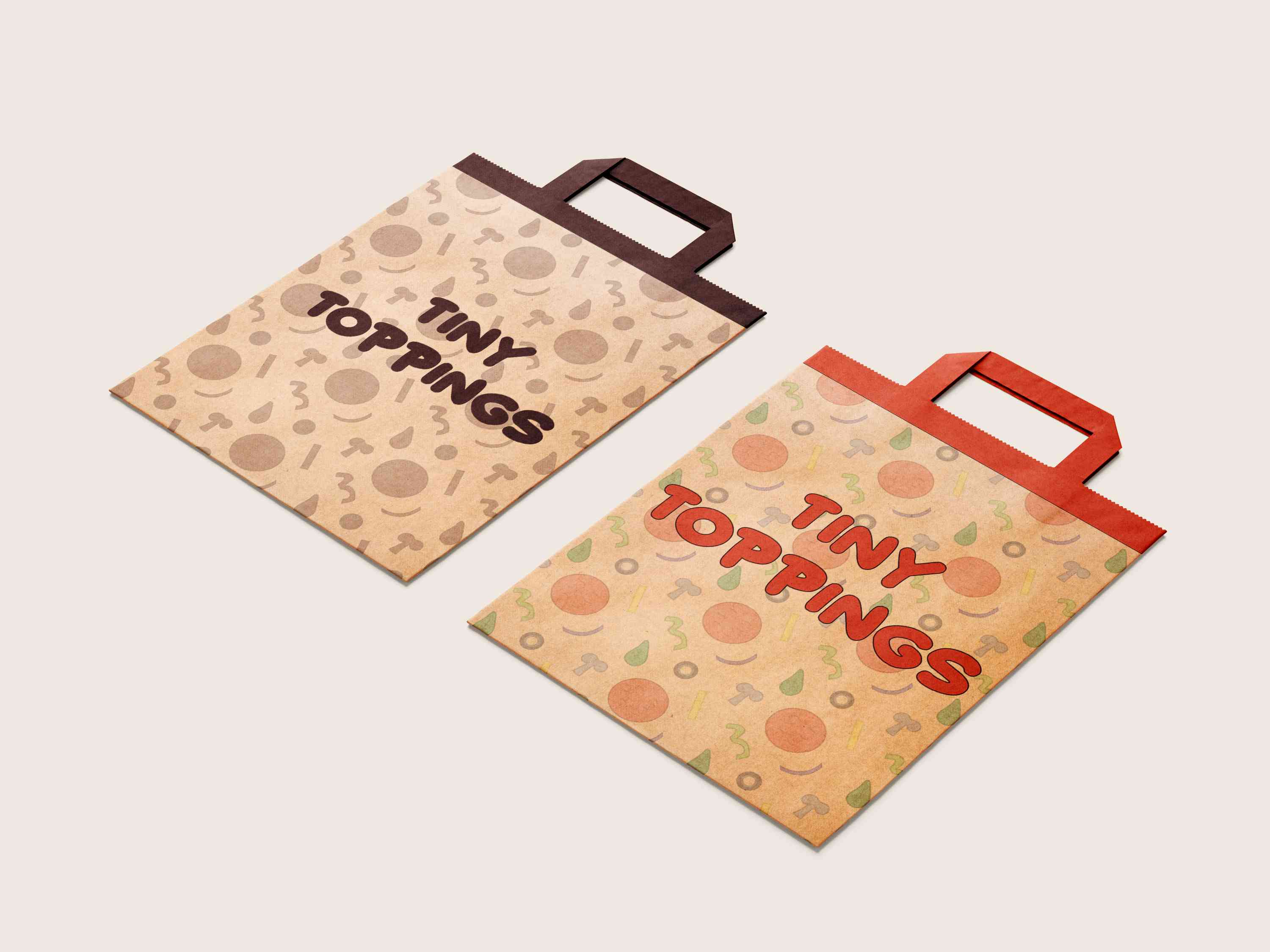
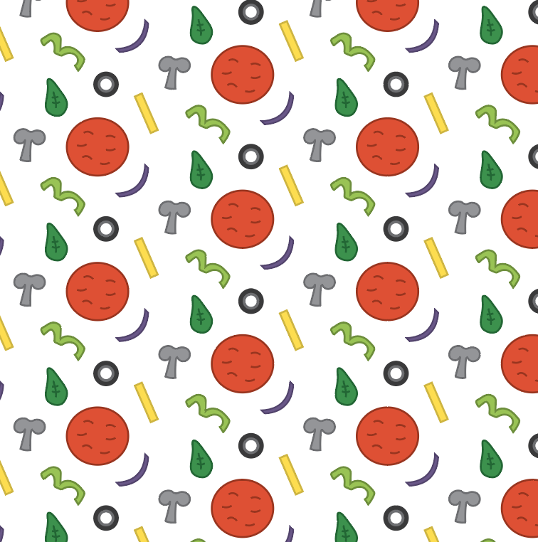
"Tiny Toppings," a kid-friendly pizza restaurant that aims to provide delicious pizzas with a fun and playful twist. The project entails creating a vibrant and engaging brand identity, including designing a memorable logo, eye-catching box packaging, and a delightful brand pattern that captures the essence of the restaurant's cheerful atmosphere and tasty offerings.
PROJECT GOALS
By aligning the new brand identity with these three main goals, we can create a compelling and impactful visual representation that not only pays homage to its roots but also propels the brand forward with a fresh and distinctive look that resonates with customers and stands out in the market.
SIMPLISTIC
Simplicity is a powerful tool in logo design.
The goal is to craft a logo that is visually
straightforward and instantly recognizable,
even at a glance.
MEMORABLE VISUAL IDENTITY
The new brand identity should be
distinctive, leaving a lasting impression on
potential customers.
COLOUR PALETTE
The thoughtfully curated selection of colors embodies the essence of the brand's identity. From vibrant hues to subdued tones, each shade tells a unique story. These colors transcend mere pigments, reflecting the brand's versatility and depth.

COMFORT
a sense of warmth and comfort, creating a cozy and inviting atmosphere for families dining at the restaurant.

BALANCE
Cream balances out the boldness of other colours and adds a touch of elegance to the overall brand identity. It creates a clean and refined backdrop that allows other colours and design elements to stand out,

ENERGY
Orange adds a pop of colour and create a sense of fun and excitement. It can be used strategically to draw attention to key brand elements, such as the logo or signage.
TYPOGRAPHY
The selected typeface showcases a dedication to transparent communication and inclusivity. Carefully chosen for it's legibility and enduring aesthetic, it effortlessly conveys the message, allowing all individuals to interact with the brand seamlessly. The typography embodies the belief that elegance thrives in simplicity, inviting a universal connection to the narrative.

STARBORN
FINAL DESIGN
The outcome of the branding project for Tiny Toppings Pizza Restaurant is a vibrant and inviting visual identity that perfectly captures the essence of the establishment. Through a playful combination of dark red, cream, and bright orange, along with whimsical typography and charming illustrations, the brand exudes energy, creativity, and deliciousness.


